

The Rotary Club of Hope Island’s website is clean and welcoming, especially for visitors. In fact, their homepage for the most part caters to website visitors and non-members and is full of interesting information about the club, while member-specific information is available on secondary pages, with simple navigation to reach it. They do an excellent job of keeping the visitor engaged in a variety of different ways, with their call to action being learn more about the club and visit.
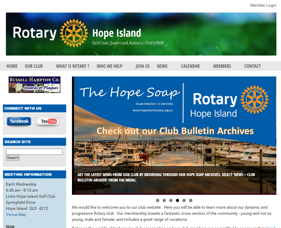
 One of the many factors that add to a great website is branding. Often times, in the race to design a good looking website, many forget that the design of the website should cater to who your audience is. Of course, design is not just limited to graphics and fonts, but the use of colors, page layout, page breakdown, and the placement of content all contribute to the overall look and feel. The Rotary Club of Hope Island opted to use the Rotary theme for website found in the ClubRunner theme library with a 2 column layout. The addition of the Rotary logo on their banner and the use of limited colors (Rotary Blue & Grey) which are in line with the Rotary's visual identity and branding shows that they tailor their website to Rotarians and showcase their brand as so.
Once you land on their website, your eyes are immediately drawn to a beautiful picture carousel with
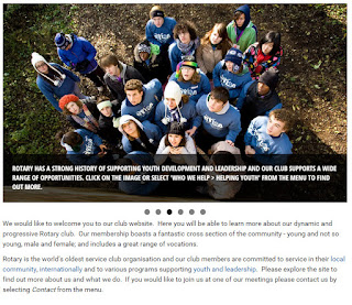 member photos and a caption that directs visitors to where they should go on the site for more information on topics related to the photos. They even use the carousel to showcase their own newsletter with a beautiful and colorful graphic. The club accomplished this using a third party tool called Cincopa from where they created their photo display and used an embed code within a custom widget to add it to their website to elevate the look of their site. As a general reminder, ClubRunner is not affiliated with Cincopa and as it is an independent platform, we are unable to provide support with its use.
Right below the carousel as you continue to browse through the top fold of the website, also known as the prime real estate of the webpage, we see a live example of what a positioning statement is. Their level of branding continues here through a succinct message where they engage their website visitor by describing their club and its members in just a few sentences along with a call to action to visit the club and learn more. This speaks to their visitors directly and elicits a feeling which makes them to relate to the club. The use of real member photos makes the club more relatable and ties in the positioning statement and website content together.
As you scroll further down, the content gets even more focused on the activities of the club which showcases how active the club is. They show a great balance of member-centric vs. visitor-centric content with the way they use the Stories widget, with visitor-centric information being added to the story brief which is what we see on the home page. As you click to read further, the content gets more member-specific. By breaking the content up into the story brief and content sections, the club also does an excellent job of bringing an element of balance onto their home page rather than making it very text heavy, which is overwhelming.
 On the left column, they made creative use of custom widgets once again showing the power of ClubRunner's Website Designer by adding a search function to their website which sifts through all their secondary pages to display the information one might seek. The club accomplished this with the use of a third party application which they added to their site using a custom widget.
In between the subtle grey colors, we see a pop of color on the left column within the Club Meeting Information widget which is showcased with a light shade of blue, attracting the visitors eyes directly to their meeting information and a link to their events calendar to see when their next meeting is. It is little enhancements like these that help elevate the look of a website in a big way.
One of the most common website design mistakes is making pages difficult to reach. How often have you been on a website and have had to click through a number of links until you found the content or the page you were seeking? Clicking is expensive and having visitors click through a number of links is comparable to creating a digital obstacle course. If a visitor or even a member has to click through dozens of links, chances are that many will stop midway. The Rotary Club of Hope Island combats this through their navigation menu, making important information such as how to join, what the club does, its history, and much more just one click away. Similarly, even for members, they've added secure internal pages which require members to log in, by adding these built-in pages to the menu, making them just one click away.
Once you land on their website, your eyes are immediately drawn to a beautiful picture carousel with
 member photos and a caption that directs visitors to where they should go on the site for more information on topics related to the photos. They even use the carousel to showcase their own newsletter with a beautiful and colorful graphic. The club accomplished this using a third party tool called Cincopa from where they created their photo display and used an embed code within a custom widget to add it to their website to elevate the look of their site. As a general reminder, ClubRunner is not affiliated with Cincopa and as it is an independent platform, we are unable to provide support with its use.
 Right below the carousel as you continue to browse through the top fold of the website, also known as the prime real estate of the webpage, we see a live example of what a positioning statement is. Their level of branding continues here through a succinct message where they engage their website visitor by describing their club and its members in just a few sentences along with a call to action to visit the club and learn more. This speaks to their visitors directly and elicits a feeling which makes them to relate to the club. The use of real member photos makes the club more relatable and ties in the positioning statement and website content together.
As you scroll further down, the content gets even more focused on the activities of the club which showcases how active the club is. They show a great balance of member-centric vs. visitor-centric content with the way they use the Stories widget, with visitor-centric information being added to the story brief which is what we see on the home page. As you click to read further, the content gets more member-specific. By breaking the content up into the story brief and content sections, the club also does an excellent job of bringing an element of balance onto their home page rather than making it very text heavy, which is overwhelming.
 On the left column, they made creative use of custom widgets once again showing the power of ClubRunner's Website Designer by adding a search function to their website which sifts through all their secondary pages to display the information one might seek. The club accomplished this with the use of a third party application which they added to their site using a custom widget.
 In between the subtle grey colors, we see a pop of color on the left column within the Club Meeting Information widget which is showcased with a light shade of blue, attracting the visitors eyes directly to their meeting information and a link to their events calendar to see when their next meeting is. It is little enhancements like these that help elevate the look of a website in a big way.
One of the most common website design mistakes is making pages difficult to reach. How often have you been on a website and have had to click through a number of links until you found the content or the page you were seeking? Clicking is expensive and having visitors click through a number of links is comparable to creating a digital obstacle course. If a visitor or even a member has to click through dozens of links, chances are that many will stop midway. The Rotary Club of Hope Island combats this through their navigation menu, making important information such as how to join, what the club does, its history, and much more just one click away. Similarly, even for members, they've added secure internal pages which require members to log in, by adding these built-in pages to the menu, making them just one click away.
Click on the club banner below to check out
and explore their site. Perhaps you might gain some inspiration for your own website!
No comments:
Post a Comment